An AI product only works if clinicians trust the interface delivering it
VideaHealth’s Viewer is the screen clinicians spend the most time in — where a dentist reviews a patient’s radiograph, consults the AI’s findings, and decides on a treatment plan. The product’s core value proposition, an FDA-cleared AI that acts as a diagnostic second opinion, lives or dies in this single interface.
When I joined, the Viewer had accumulated features over several product cycles without design governance. Tools, imaging, and clinical context were scattered across the screen with no predictable layout. The AI’s findings competed visually with everything else on the page, making it harder for clinicians to understand and act on the information that mattered most. NPS sat at 18.
This wasn’t a visual polish problem. The interface was actively undermining the clinical value of the AI. If a dentist can’t quickly parse what the AI is telling them, correlate it with the radiograph, and explain it to a patient, the product fails at its fundamental job.
How do you design an interface that makes an AI-generated second opinion feel like a natural extension of a clinician’s own diagnostic process, rather than a separate system they have to interpret and translate?
Problems Identified
Three compounding failures in the existing experience
No spatial model for clinical reasoning
Tools, image thumbnails, and clinical diagnostics were scattered without clear structure.
AI findings lacked contextual framing
AI findings were presented as flat data with no visual hierarchy separating them from standard controls.
The UI lacked patient education
The Viewer didn’t surface the right information at the right moment to support chairside conversations.

Design Process
From audit to architecture in focused, deliberate steps
I drove the design strategy end to end, collaborating with our PM on customer discovery and engineers on technical feasibility. The process was intentionally compressed: two months from first audit to shipped product.
Cataloged every usability issue against clinical workflow patterns, creating an evidence-based map that gave the team a shared language for what was broken and why.
Visited dental practices to observe chairside workflows during real patient appointments. Key insight: clinicians weren’t just reviewing images — they were building a narrative for the patient, and the UI needed to support that arc.
Mapped the spatial grammar clinicians carry from other imaging platforms — revealing patterns to honor and assumptions to challenge. The opportunity: combine the strongest existing conventions with a structure purpose-built for AI-assisted workflows.
Ran virtual usability sessions to stress-test the new architecture with clinicians before committing engineering resources, de-risking structural decisions that would be expensive to change later.
Design Principles
Three principles that governed every decision
Spatial Consistency
Every element has a predictable home. Toolbars live on the left, imaging holds the center, clinical context lives on the right. Clinicians should never wonder where to look.
Contextual Clarity
AI findings are presented with the supporting detail a clinician needs to trust the recommendation, explain it to a patient, and act on it. The interface does the framing for the clinician.
Progressive Disclosure
Surface what’s needed for the current task, tuck away the rest. Feature density is managed so the interface feels focused even as capabilities expand.
The Solution
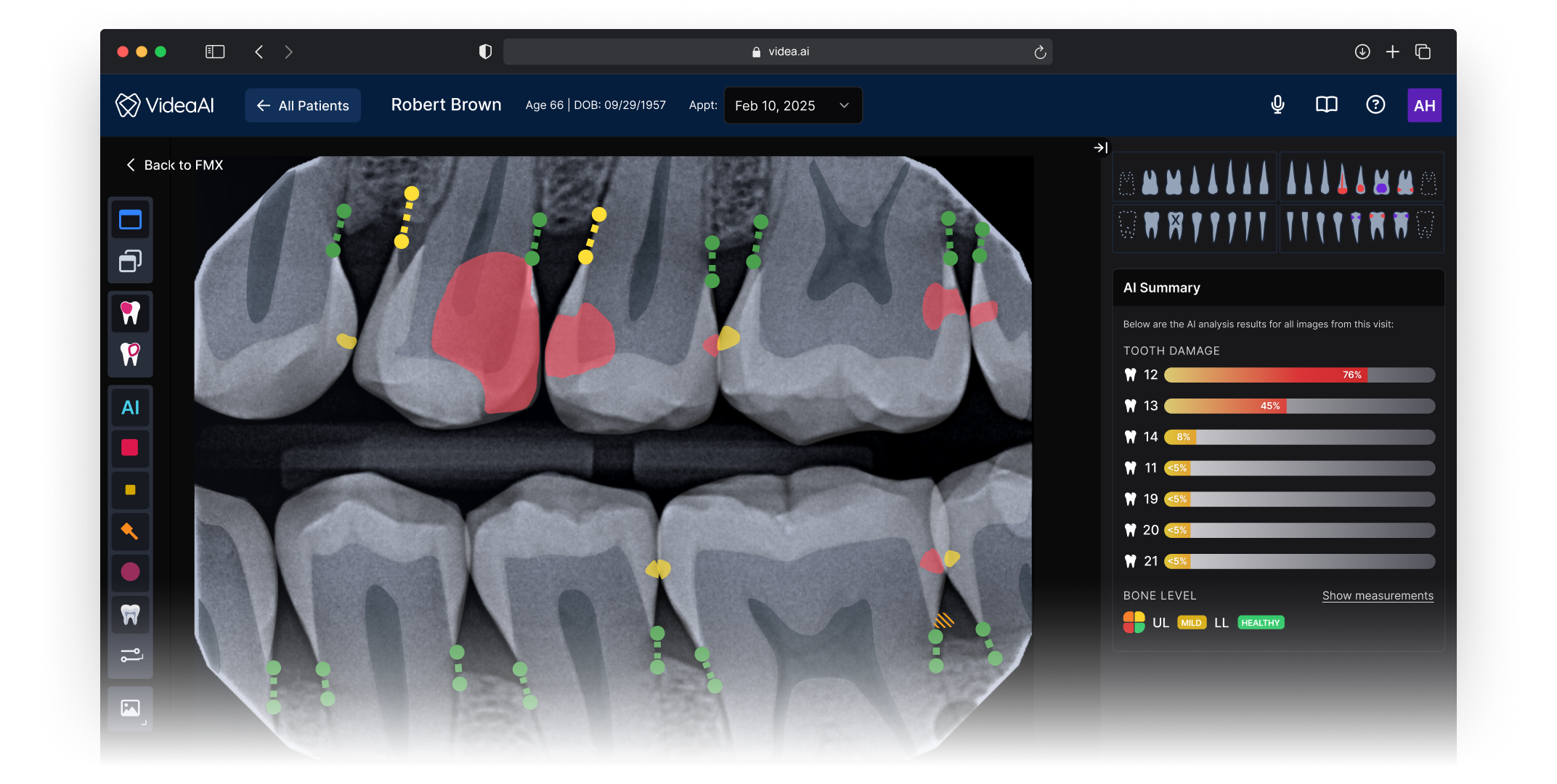
A three-panel architecture designed for AI-assisted clinical decisions
The new Viewer introduced a spatial structure that gives every element a predictable home, and more importantly, creates a clear information flow that mirrors how clinicians actually move through a diagnostic decision. The architecture wasn’t borrowed wholesale from existing tools — it was designed to solve a problem most imaging platforms don’t have: presenting an AI second opinion alongside the clinician’s own assessment in a way that feels integrated rather than intrusive.
Actions clinicians reach for without thinking: zoom, contrast, measurement, annotation. Positioned for fast, habitual access so the toolset never interrupts diagnostic flow.
The radiograph occupies maximum real estate with AI findings layered directly onto the image. Clinicians can see what the AI detected in spatial context, correlated to the exact anatomy, rather than referencing a separate list.
Patient data, finding details, confidence levels, and supporting annotations. This panel provides the narrative context a dentist needs to explain a recommendation to a patient chairside.


Impact
Measurable outcomes across satisfaction, revenue, and retention
NPS moved from 18 to 63 the quarter after launch — a 45-point increase that shifted the product from detractor territory into promoter range. But the downstream effects told the fuller story.
The redesigned experience directly contributed to $10M+ in new revenue. The improved product became significantly easier to sell and expand into new accounts because prospective customers could immediately see and understand the AI’s clinical value during demos, instead of getting lost in a cluttered interface.
Just as importantly, we retained 6+ top DSO customers who had been at risk of churning. Once their offices experienced the redesigned Viewer, practice staff were engaging with the product so much more effectively that DSO leadership chose to stay and expand. For a platform selling into large dental organizations, keeping these accounts was as strategically valuable as any new deal.
Clinicians struggled to locate AI findings within the cluttered interface. Patient conversations were harder because the UI didn’t support visual storytelling.
NPS of 18 reflected deep dissatisfaction. At-risk accounts were evaluating competitors. The product’s AI capability was strong, but the interface was undermining it.
Clinicians could immediately parse AI findings in context. The structured layout supported chairside patient conversations.
Practices reported diagnosing more conditions earlier and more often. Patient schedules filled because the AI-assisted experience helped patients understand what needed to be done.
Reflection
What I’d carry forward
Go scrappy, go fast
A focused heuristic audit and targeted customer discovery gave us everything we needed to make confident structural decisions. The two-month timeline was a feature, not a constraint — it forced us to prioritize the decisions that mattered most and ship before the opportunity window closed.
Structure unlocks everything
Before debating any individual feature or interaction, getting the macro spatial structure right unlocked clarity for every downstream decision. Once the three-panel model was in place, it became the foundational pattern for all subsequent feature work on the platform.
Respect mental models, then extend them
Clinicians carry deep muscle memory from other imaging tools, and designing with those patterns reduced the learning curve dramatically. But the job wasn’t just replication. The real work was extending familiar patterns to accommodate something new: an AI diagnostic layer that no existing tool had established conventions for. Meeting clinicians where they are, then guiding them somewhere new, was the design balance that made this work.
Instrument baselines earlier
I had strong signal that task completion times improved, but I didn’t set up baseline measurements before the redesign. Having quantitative workflow metrics alongside NPS would have made the impact story sharper and given us a stronger framework for measuring future iterations.